Matching Time
Nov 16, 2023
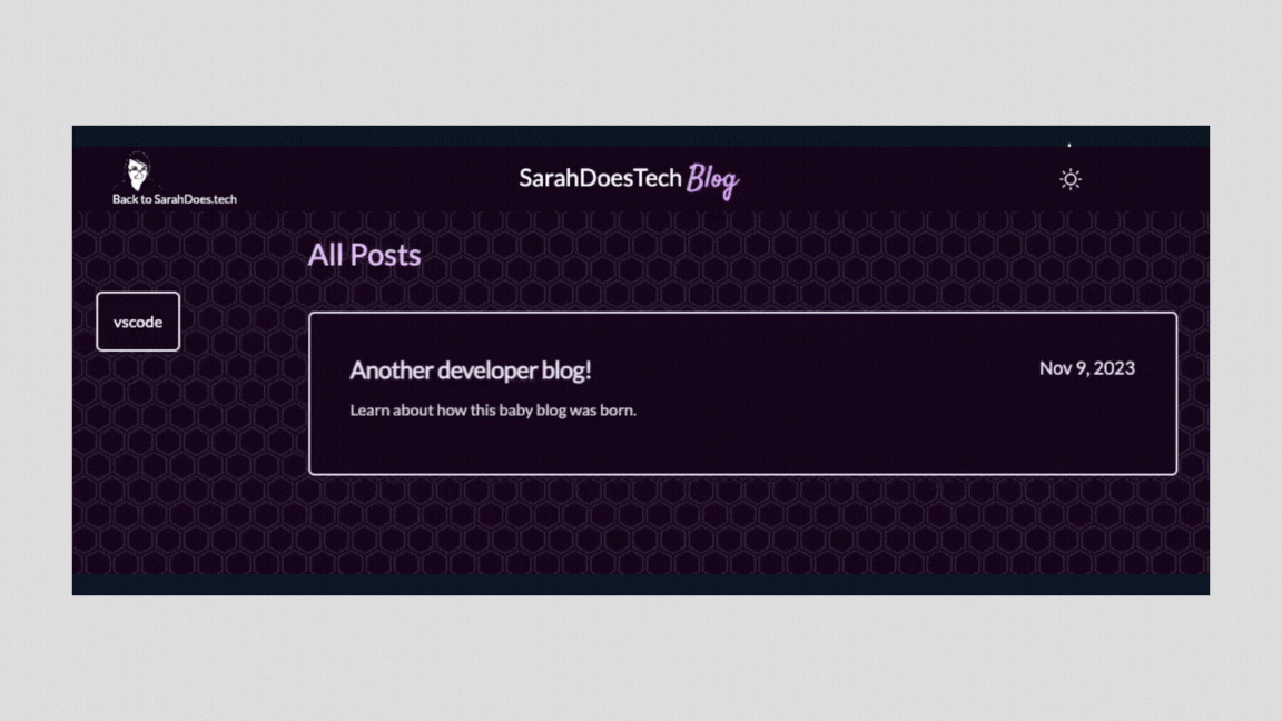
In my last post, I covered how I spun up this blog using a YouTube tutorial and it looked just like the blog in the tutorial so let's fix that.
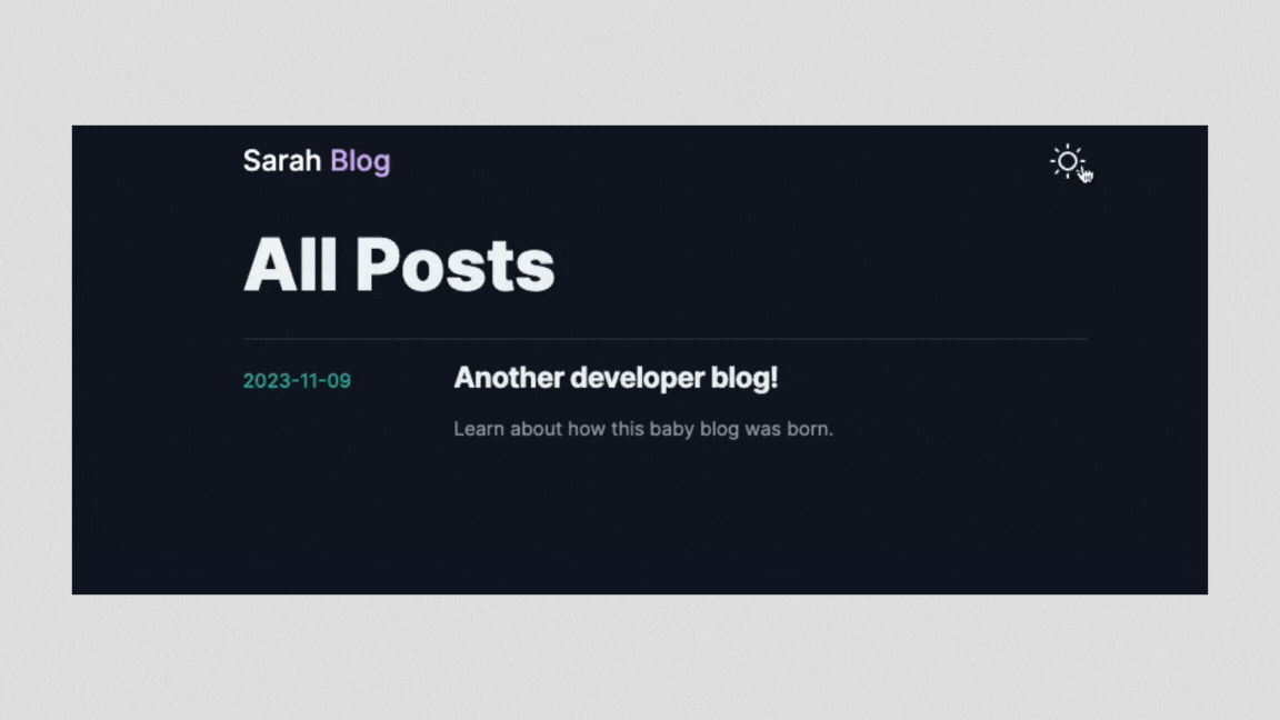
After completing my Fullstack Developer Bootcamp I wanted to get a better understanding of Vanilla JavaScript and that's what my portfolio is currently built in. I still really like the look of my portfolio so let's get this blog looking similar.
I have to say, I was resistant to Tailwind CSS for awhile because I think learning how to do semantic HTML and CSS is important and many developers will skip over it to lean on something that makes it "easy". One thing I really like about Tailwind so far is that it will show you the CSS that will be generated with the classes you use.
My other big resistance was that when I’ve tried some of the other popular CSS frameworks/libraries of days gone by, I never loved how you could tell what it was built with. I LOVE that you can customize Tailwind really easily so you’re not locked in to a specific look.
Icons
I recently switched my portfolio site over to using Phosphor Icons , a free open source icon library. It has lots of options for how to use it and for this project I installed their React package and was up and running.
Colors
To get started, I extended my theme in my tailwind.config.ts file. I have two main colors that I use already. I have an existing palette saved on coolors.com. I found this site years ago and love it for generating and exploring different color palettes.
To get the color ranges for Tailwind I used uicolors.app that I was introduced to at a TailwindCSS class at Frontend Masters. It’s another fantastic tool I highly recommend.
tailwind.config.ts
language: typescript
theme: {colors: {'black-russian': {'50': '#f6edff','100': '#f1dfff','200': '#e6c4ff','300': '#daa1ff','400': '#d57cfd','500': '#d25df7','600': '#d03fec','700': '#ba31d1','800': '#932ba8','900': '#742a85','950': '#19091c',},'alto': {'50': '#f7f7f7','100': '#edeced','200': '#dfdedf','300': '#c9c7c9','400': '#aeacae','500': '#9a979a','600': '#8a8689','700': '#7c797c','800': '#686568','900': '#555355','950': '#363536',},}},
Fonts
I'm using a few Google Fonts on my portfolio site. Optimizing and importing them in Next.js and using them in Tailwind is pretty simple. You can even check out the Next.js documentation for optimizing fonts.
First, import them in to your main app file. In my project, this is layout.ts After importing, you'll want to define the font and add the variables in to your body tag.
layout.ts
language: typescript
import { Lato, Satisfy, Fira_Code } from 'next/font/google'const lato = Lato({weight: '400',subsets: ['latin'],variable: '--lato',fallback: ['sans-serif']})const satisfy = Satisfy({weight: '400',subsets: ['latin'],variable: '--satisfy',fallback: ['cursive']})const fira_code = Fira_Code({weight: '400',subsets: ['latin'],variable: '--fira-code',fallback: ['mono']})export default function RootLayout({children,}: {children: React.ReactNode}) {return (<html lang="en" suppressHydrationWarning><body className={`${lato.variable} ${satisfy.variable} ${fira_code.variable} font-lato`} ><Providers><Navbar /><main className="max-w-6xl mx-auto px-4 sm:px-6 lg:px-8">{children}</main></Providers></body></html>)}
After you've got your fonts set in the layout.ts, you can add the variables in to your tailwind.config.ts
tailwind.config.ts
language: typescript
theme: {colors: {'black-russian': {'50': '#f6edff',...},'alto': {'50': '#f7f7f7',...},},fontFamily: {satisfy: ['var(--satisfy)'],lato: ['var(--lato)'],firaCode: ['var(--fira-code)']}},
Background Images
On my portfolio site, I use Hero Patterns for some background variety and wanted to incorporate those as well. A quick look through the Tailwind site, I found that you can do this by customizing your theme and defining background images it makes them super easy to bring in to my project.
tailwind.config.ts
language: typescript
theme: {extend: {backgroundImage: {'hexagons-dark': 'url("data:image/...")','hexagons-light': 'url("data:image/s...")',},},colors: {...}}
Once I got things in place, I got to work updating the blog CSS. The Tailwind documentation is pretty great and I spent a good amount of time exploring how to do responsive content.
After Edit:
Once I posted this, I noticed that my images were ridiculously tiny.
I need to explore the Sanity.io api for images some more, so in the meantime, I've added a sort of hacky little fix to have larger images show up. So look out for a blog post about image sizes. 😂